The Display Tab for the Chat component defines visual configuration of the component.
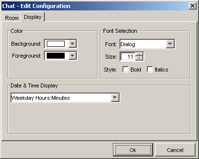
Background: This drop-down list displays a list of colors and allows the user to specify the component's background color.
Foreground: This drop-down list displays a list of colors and allows the user to specify the component's foreground color, including text.
Font: This drop down control allows the user to select from a list of available fonts to be used in the component display.
Size: This spinner control allows the user to select a font size for use in the component display. Valid values range from 6-48 point size.
Style: These checkbox controls allow the user to display the selected font in either bold or italics in the component display.
Date and Time Format: This drop down control allows the user to select the format for displaying the date and time of messages submitted in the chat component. The available display choices are:
Hours:Minutes
Hours:Minutes (24 hour)
Weekday Hours:Minutes
Weekday Hours:Minutes (24 hour)
Month/Day/Year Hours:Minutes
Month/Day/Year Hours:Minutes (24 hour)